
Foundation And Building A Responsive Front-End
by Scott Robertson & Steven Bone on 08/26/14
As our codebase grew, adding new features was getting increasingly difficult. Implementation of design elements became less cohesive. Each page was treated inconsistently with the next, leaving a less than optimal user experience. We wanted a way to help combat this pattern. With a new design and styleguide for our application, it was the perfect time to establish a more modular approach.
Instead of trying to build our own front-end framework entirely from scratch, we decided to evaluate popular options out there and see what made sense for our purposes.
Our Criteria
We came up with a few things we knew we needed in a framework:
- Design agnostic
- A flexible grid
- Responsive built-in
- Utility classes (for common styling patterns)
- Conventions for common component implementations (buttons, headers, forms)
Candidates
One major caveat with using a framework is having to fight with design assumptions and overriding much of what a framework provides. We knew this could not be avoided completely, but we wanted something that was as design agnostic as possible and that could help us establish conventions for writing our own modules.
Our initial list of candidates included:
We had reservations for overly complex or overly simple frameworks. We knew we wanted something that was well tested and actively developed. Several of the above options could have worked out just fine, but really what swayed us were a few standout features that we found particular useful.
Foundation
In the end, we decided to go with Foundation. We chose Foundation primarily because of their grid system. It was clever in design and gave us the simplicity, flexibility, and readability we wanted. Let's take a quick look at how it works.
Grid System
Every column in a grid can be set to a certain width based on screen size using Foundation's small, medium, large, x-large size denominations:
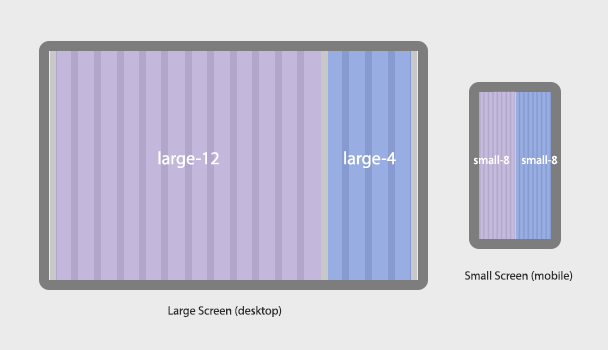
<div class="row">
  <div class="small-8 medium-10 large-12"></div>
  <div class="small-8 medium-6 large-4"></div>
</div>
With the above we're using a 16 column grid, so each row must add up to 16. On small screen sizes (think mobile phone) the columns would be 8/16 (classes small-8 and small-8). On a medium screen size (think tablet) the first column is 10/16 (class medium-10) and the other 6/16 (class medium-6) and so on. See the image below (showing only small and large screen sizes).
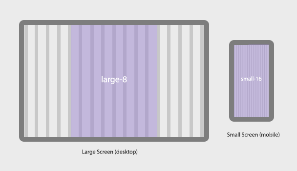
But there is more! Say you want a centered container on large screens that is only 8 columns.
<div class="row">
  <div class="small-16 medium-16 large-8 large-centered"></div>
</div>
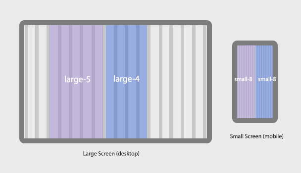
Even further, Foundation gives you offset and end classes that allow for more flexibility.
<div class="row">
  <div class="small-8 medium-10 large-offset-2 large-5"></div>
  <div class="small-8 medium-6 large-4 end"></div>
</div>
These examples are just the tip of the iceberg for some of the useful things you can do with Foundation's grid system. You can read more about it here.
More from Foundation
As much as we were won over by Foundation's grid system, we discovered many more useful tools along the way.
Utility & Visibility Classes
Foundation has utility and visiblity classes that proved essential when coupled with their grid system for building a large responsive application.
Utilities include alignment classes like text-center, text-left, and text-right for positioning column content. In responsive Foundation fashion these could be prepended with small, medium, large, etc. to target a specific device/screen size.
Visibility classes like show-for-small-only, hide-for-small-only, and show-for-medium-up, etc. made it easy to hide or show content depending on the screen size.
Foundation's classes were a great starting point, but we didn't solely rely on what was provided. It served as a catalyst to many other utility classes that we added for our specific needs, including classes for spacing, borders, backgrounds, tables, forms, etc. All of which provided a solid base for building out our various modules and pages.
You can read more about Foundation's utility classes and visibility classes in their official documentation.
Class naming
In going all in with Foundation, we adopted their convention of having a base class for a particular style or module and then used additional classes to extend that style. This allowed us to maintain greater consistency. Here's an example of a Foundation button element:
<a href="#" class="button">Button</a>
<a href="#" class="button radius alert">Alert Button (Rounded corners)</article>
Here's an example of one our own custom modules for element agnostic headers:
<h1 class="head primary">Primary Heading</h1>
<h1 class="head primary alt">Primary Heading w/ Alternate Font</h1>

<h1 class="head secondary">Secondary Heading</h1>
<h1 class="head secondary inverse">Secondary Heading w/ Inverse Color</h1>

<h1 class="head alt">Head Alt</h1>
Using this approach allowed us to easily create a typography system based on the designs that looked like this:

Handy Javascript utilities
Foundation also has a nice collection of utilities such as throttle and debounce, which we merged into our own Utils object as show below:
Foundation.inherit(VHX.Utils, 'random_str data_options throttle debounce image_loaded random_str');
Handy Javascript plugins
Most of our Javascript was custom written, but we made use of any Foundation plugins we could, including their Modal Reveal and Equalizer plugins.
Foundation Implementation
We first installed Foundation by using their Ruby Gem. In order to have greater control of the ordering of files and to continue to make use of Rails' built in asset pipeline we setup a Foundation include file (named foundation_include.sass) that looked like this:
@import "settings";
@import "foundation";
We imported a settings SASS file with all the customizable Foundation settings and foundation the framework itself.
Each primary section of our site would have a core manifest where we'd include our Foundation include file, other core SASS files, section SASS files, and any shared SASS modules. It looked something like this:
# --- core ---
*= require normalize
*= require ./_core/foundation_include
*= require ./_core/extensions

# --- admin ---
*= require_directory ./admin/_shared

# --- share ---
*= require ./_shared/buttons/buttons
*= require ./_shared/buttons/buttons.line
Conclusion
Foundation was initially created for designers to rapidly prototype, as was evident in its design. This philosophy fit well with our needs, and we have been very pleased with using it.
The only slight tradeoff was having to overwrite a lot of their styles to get the look and feel that we wanted. A majority of our modules and CSS class utilities are custom and in many cases we had to use the dreaded !important to ensure our styles overrode Foundation's. We knew however, that this might be unavoidable to get our specific aesthetic.
In the end, we have been very pleased with the usefulness and efficiency Foundation provided us and would gladly recommend it to anyone else looking to try out a front-end framework.